Tuesday 20 June 2017

Create Art


This is a piece I have created for Liza's Design Team. Although it may look quite simple there was actually quite a lot that went into it. Unfortunately, I can not get a good picture of the finished item. When we moved my mini photo studio got packed away and I have not found it yet. I hope by breaking down the processes you will be able to see the work that went into this.

I started with a 5 x 7 canvas board, I don't often use this type of base so it was a challenge to me to begin with. Although they are supposed to be gesso primed I always give my canvases a coat of my gesso anyway so that was my first step.


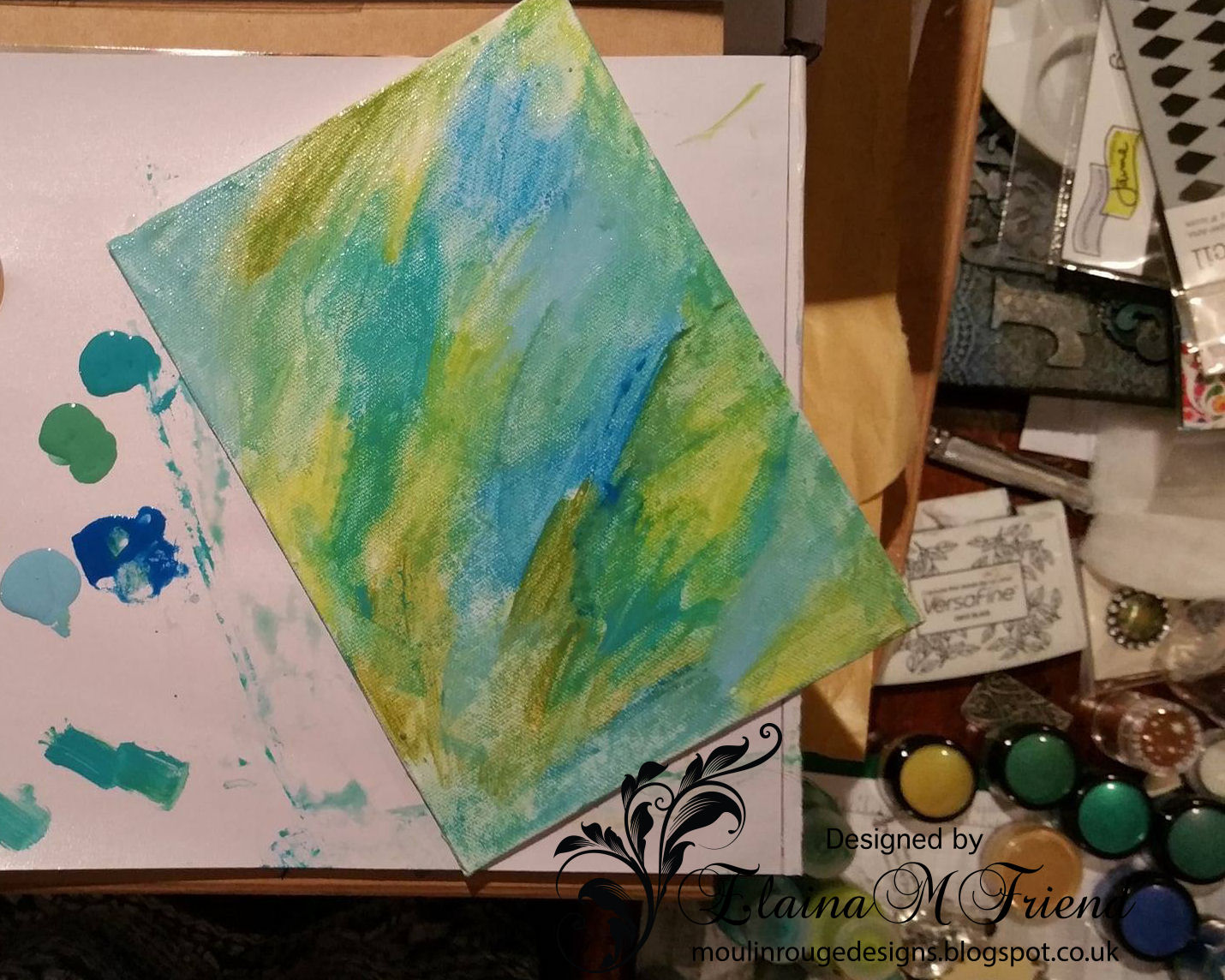
I had no idea of what I was going to do when I started this project but I thought I would do things a little differently than I usually do. I opened up my draw of acrylic paints and pulled out three colours I liked together. A lime green, a turquoise and an aqua. I just added them to the canvas and blended them together. I thought the colours looked a bit flat so I sprayed a clear sparkle on top just to lighten it.


My next step was to add some texture to the background, normally I do this first and add the colour afterwards. I used the stencil that Liza sent me in my DT box but I did not have a stencil paste or texture paste in a colour I thought worked with the background paint. So I used some of the paste and gold mica from my DT box and mixed them to make a gold stencil paste.


Next I decided to use the chipboard piece. I considered painting it but then remembered the gold leaf we had been sent. I used size to adhere the gold leaf to the chip board. Once it is dry you can use a dry brush to remove the excess gold leaf and bring out the detail. Remember to brush off the excess into a container so you can use it in another project.


As the project was taking on a steampunk look I picked out some metal pieces from the DT box. The large butterfly I covered with 2 coats of green wax to give it a bit of a patina. I lifted the top set of wings to give it dimension and added the light bulb charm to the centre to represent the body. I then added the clock to the bottom of the piece to balance it. I decided that somethings needed help to stand out from the background so I added a black outline around the chipboard piece and the clock.


Lastly I added the words 'Create Art'. I painted them with the turquoise paint and highlighted with gold paint. Sorry this picture is not very good but it shows the wording better than the top photo. So as you see, even a small canvas can have a lot of steps to complete it but it is worth it in the end.


Saturday 17 June 2017

Altered Artists Palette


I have been honored by the owner of Liza's Craft Shop and made a member of her Mixed Media Design Team. I have found a love for the free spirit of Mixed Media technique which I did not think I would as I am not keen on getting messy.

This Altered Artists Palette is the first official piece I have produced for her using some products from her Face Book shop. The palette itself has texture on it created by using modelling paste through a stencil I received in Liza's first Mixed Media box.

I created the ombre effect by using 3 colours of Tattered Angels Ink Spray, those and the angel charm and word were again from the Mixed Media box. The frame and straws were from my stash.

Once the palette was finished it just seemed to me that it needed something else and by accident I laid it down on a canvas I was working on and I was inspired by the effect. So I pulled out a canvas, added background texture and coloured and added the palette to it. Now I am happy with the piece and I am satisfied that it is complete.


Monday 10 April 2017

Dreamer


Here is my latest piece of Mixed Media work. This canvas is influenced by the artist Finnabair whose work I love but this is the first time I have tried the style.


The design is made up of many layers, some of which are hardly seen in the finished product but they all add to the final effect.

The first layer consists of rows of flat lace glued to the canvas to give a textured background. On top of that chip board letters and shapes are glued to give a base on which to put the photograph

The photo is added next and when it came to choosing a photo I did not want to use a photo of myself the way Finnabair uses photo's of herself in her work. Instead I printed out a suitable vintage photo from a collection I have.


Once the photo was in place I built up trinkets around it. I used all sorts of bits and pieces, clock parts, buttons, paper flowers, metal shapes, sea shells, bits of broken jewellery etc.


Once I was happy with the composition I used blue, turquoise, verdigris and pearl spray paints. Building up the colour in layers until I was happy with the effect.

It was a lot of work but well worth while.

Sunday 5 March 2017

Altered Bottle


This started life as a boring brown beer bottle, it is my first attempt at an altered bottle and I am very pleased with it.

I started my covering the while thing in black gesso, I gave it two coats to ensure the glass was properly covered. Next I used a mix of spray inks to colour the bottle. I used the blue first and then the other colours over that, I then added a coat of clear crackle to get the aged effect I was after. Finally, once the crackle had done it's thing, I used a metallic wax in places to give some accents.

When it came to decorating the bottle I first applied a piece of blue sparkled net. It is difficult to see in the main  picture but can be seen a bit better in the close up below. I topped this with a variety of mulberry paper flowers, beads, a glass spray and some gold wire.